

Dog breeders aren’t the techiest and geekiest people; some are older than average while others simply don’t know how to properly set up and run their kennel website. With years of experience, we’ve noticed the top mistakes most breeders make on their kennel websites.
Unlike back then in 2005, everybody has access to intuitive and easy-to-use tools today. It’s easier than ever to create a beautiful and functional breeder website. Yet, dog breeders seem to struggle to even find these platforms, tools, and plugins. Their websites look outdated and they collect the worst mistakes.
Click here to get your .com domain name today for very cheap!
Here is our list of the top 7 mistakes breeders make on their kennel website.
Turn the Music Off
The worse mistake of all is having any song playing when you navigate a website. This was pretty frequent in the early 2000’s and slowly disappeared. Most website having music are seeing their visitors simply close the window within a couple of seconds.
Make yourself a favor, never add music to your website especially with an automatic playback. It’s intrusive, and rarely the songs picked are the ones the visitors would like. Adding YouTube videos and other media contents is great since it offers the visitors the choice to click to play, or not.
Also, because most visits are now initiated from a mobile device, chances are your visitors is listening to his own music, or a podcast, or the radio. Therefore, your music playing will stop theirs. Ouch!
Your Website Is Not Mobile-Friendly!
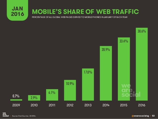
The last years have seen a drastic change for all websites in the World. Indeed, visitors on mobile devices are growing above the share of visitors on a desktop. So from now on, websites must be built thinking about mobile users first; and then desktop users.
[pullquote-right]In the U.S., 25% of mobile Web users are mobile-only (they rarely use a desktop to access the web)[/pullquote-right]
Trust me, I know how hard the new is to swallow. Desktop and laptop devices are so much easier to deal with. Screens are big so we have plenty of space to play with. We can display large headers, beautiful images, sidebars, widgets and more. These large devices are also more powerful so we can use heavier javascripts and styling.
All of that has changed.
Building a mobile-first website means having a lot less screen real estate to play with. Information must appear above the fold and fast. Mobile networks may be fast but not as fast or reliable as broadband connections. Somebody on a train platform has only 5 seconds to display your page before the signal drops.
So yes, you must immediately redesign your entire website and make it truly mobile-first and mobile-responsive. If you are using WordPress to power your website, most themes available are mobile-friendly.
Last point, Google has recently announced that mobile-friendly websites will rank higher.
Styling Is All Over the Place
Non-techy users who are building a website often don’t care about layout and design consistency. Having visited thousands of different websites in the past, they remember bits of some random websites and want to imitate. Although the breeder himself is thrilled by his own achievement, he eventually ends up with a dirty website with too many different blocks, styles and colors.

A website has to have a cohesion in its look and feel. For example, we went with orange as highlight color, and we stick to it (header, titles, links, etc.)
Too many kennel websites have:
- 5+ colors on a single page
- 3+ font types that are barely readable
- different borders for different blocks
Also, page structure matters. A visitor wants to quickly understand where to click to get the information they are after. A sidebar or menu must be clearly visible and well laid out. Don’t overstuff these areas because people may have decision fatigue and just leave your website.
Your Breeder Website Is Way Too Slow
[adwithin]
Every webmaster faces this issue at one point or another, not just dog breeders. Here at Breeding Business we are currently working on a new version puttin mobile users and fast delivery of the website first. So don’t worry, it’s problem that has so many possible causes which makes it hard to fix.
Yet, unless you website has thousands of visitors daily, it shouldn’t be that long to load a page. A handful of seconds to be fully loaded is a maximum and most kennel websites are going way above that threshold.
Google seems to penalize slow-loading websites so it’s worth fixing if you want to receive more people organically through search engines.
Possible causes for a slow-loading page or website are:
- too large images — reduce the dimensions and compress each image on each page
- server response time — host your website with a quality web hosting service
- large page size — enable gzip compression to reduce the size of each page load
- lack of browser cache — leverage the visitor’s cache to avoid loading everything at each page load
There are dozens of other reasons and using an online speed test like GTmetrix can help you target what should be prioritized and immediately fixed.
You Don’t Update Your Kennel Website
Look at 90% of dog breeder websites and you’ll see a digital graveyard. Even if you want to use your website as a business card, you need to update it so it doesn’t make you appear to be AWOL.
Updates can take different forms:
- a modern design to show you are still here and in touch with the current state of the Internet
- some written updates about your new litters or dogs
- new pictures of your four-legged family
- a feed of your latest Instagram pictures
There are so many ways to show that a website is still alive and kicking, so just set aside an hour or two every week and post a quick update.
A Lot About You, Very Little About The Breed
Most breeders offer very little literature about the breed they love and care for. Dog breeders often talk about their very own dogs, their very own awards and titles, their very own champions, their very own future litters, and so on.
Besides being extremely self-absorbed and self-centered, you aren’t showcasing your knowledge of the breed and dog breeding expertise through self-love.
Even worse, don’t just copy and paste the breed standard or articles from your national breed club: your visitors have read these a gazillion times already.
Instead, why don’t you write some:
- opinionated articles about the breed
- reports on your latest dog shows
- unusual facts you noticed about the breed
- and so on…
Innovate and be daring.

It’s 2017: Don’t Create, Document
Last but not least; dog breeders aren’t documenting their journey enough. To generate interest and enthusiasm around your kennel name or bloodline, you want to share with your audience how you are progressing.
Don’t just share the good and successes, it doesn’t look authentic. Instead, share how hard dog breeding can be, how much money you’ve lost at first, how tiring and difficult it is to clean and disinfect your dog areas daily, etc. Share the products, tools and resources you’ve found that helped you remove pain points. Share reviews of any products related to your dog breeding activity, and be honest, even if the products very poor.
Not only people will admire you for doing that, other breeders starting with their kennel will follow you closely as an example. Plus, your audience will offer your a different outlook and perspective on your situation when you are struggling.
Nowadays, it’s common practice for entrepreneurs and start-ups to share their journey and income reports. It is an awesome initiative that dog breeders should all follow.
Last Words
Having a website for your kennel is easy and there are so many tools available these days to make it look perfect. However, content is king and you should write original articles about your breed, your experiences and what your goals are. Social medias can help you spread the word and get attention from fanciers within your breed!
3 comments on “7 Worst Mistakes Found On Kennel Websites”
Oh, the rap music blasting on every tab really grinds my gears with some breeder websites! Luckily you can turn it off, but you have to scroll down to the very bottom of the page every single time you open one.
Yep, bully breeders are usually guilty of this!
The worst for me I think is the fonts are illegible, especially when it is also brightly colored fonts. My eyes always have to adjust after leaving the site.